
Graphic Design That Drives Action: Standards Every Nonprofit Should Follow
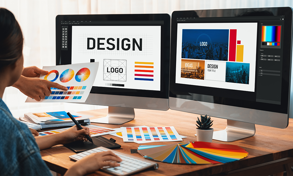
Let’s face it, design can feel intimidating if it’s not your background. But here’s the thing: your nonprofit’s design isn’t just about looking polished. It plays a big role in whether people trust your organization, understand your message, and feel compelled to act.
Whether you're putting together a donation page, creating a flyer for your next event, or designing your monthly newsletter, consistent and thoughtful graphic design helps your audience feel confident and connected.
The best part? You don’t need to be a professional designer to make a professional impact. By following a few key principles, you can create visuals that look great and get results.
Let’s walk through the graphic design standards every nonprofit should follow and why they matter.

1. Stay On-Brand…Everywhere
One of the most important things your nonprofit can do is maintain consistent branding across all your materials. This might sound simple, but it’s easy for things to get off track, especially when multiple people are creating content, or you’re using third-party tools that don’t automatically carry over your brand elements.
When your audience sees the same fonts, colors, logo, and style across platforms, such as your website, donation pages, social media, email, and print, they start to recognize your organization instantly. That recognition builds trust. It tells your supporters, “We’re professional, we’re reliable, and we’re all in on our mission.”
To keep everything aligned, develop a brand-style guide. This doesn’t need to be overly complex, but it should include your logo variations, a color palette with hex codes, font pairings, and some general guidance on photo styles and tone. Once you have that in place, make sure everyone on your team, or anyone designing for you, uses it as their north star.
Example: charity: water

2. Keep It Simple and Clear
It’s tempting to pack a lot of information into your visuals, especially when you’re passionate about your work. But when it comes to design, less is usually more. Simplicity helps your message come through clearly, especially for people who are quickly scanning your content on their phones or in their inbox.
Every element you include, whether it’s text, an image, a button, or a background pattern, should serve a purpose. Ask yourself, “is this helping someone understand what we do, why it matters, or what they should do next?” If not, it’s probably safe to leave it out.
Also, don’t underestimate the power of white space. It might feel like you’re leaving parts of the page empty, but you’re giving your audience breathing room. White space helps important elements stand out and keeps your layout from feeling overwhelming.
Example: Feeding America

3. Use Emotionally Resonant Images
Often, photos are the first thing people notice on a page or post, and the right image can tell your story faster than words ever could. That’s why it’s important to be intentional about the images you choose.
Instead of using generic stock photos, opt for real images that show the human side of your mission. A single, powerful image of someone directly impacted by your work can create an immediate emotional connection. On a donation page, one compelling photo, ideally placed beside or above the donation form, can give potential donors a visual reminder of why their gift matters.
Avoid using collages or image sliders that can distract from the main message. Whenever possible, invest in high-quality photography. If hiring a professional isn’t in the budget, candid shots, taken with a good smartphone camera and decent lighting, can go a long way.
Example: Chainfree Chattanooga

4. Use Alignment and Visual Hierarchy with Intention
When your design elements are aligned and organized with care, they help your audience focus and understand what’s most important. This is where visual hierarchy works. This is a design principle that guides the viewer’s eye through your content in a logical, engaging way.
Start by deciding what the most important message is. Is it a call to donate? A date for an event? A compelling stat or quote? That should be the most visually dominant element—whether it’s through size, bold text, or placement near the top.
Use consistent spacing, font sizes, and colors to create a natural flow from one element to the next. Most design tools, like Canva or Adobe Express, offer built-in grid lines and alignment guides. Please use them. They help you avoid the “eyeballing it” approach and give your designs a polished, professional feel.
Example: The Noun Project
5. Design for Purpose, Not Just Looks
It’s easy to get caught up in making something that looks nice, but effective design always starts with purpose. Every graphic you create should be tied to a goal, whether that’s encouraging someone to donate, sign up for a newsletter, attend an event, or simply understand your mission better.
This is especially true for high-impact pages like your donation form. Make sure the layout is clean, the call-to-action is clear, and the design supports the emotional and logical reasons for giving. For example, you might highlight specific giving levels with visual cues, “$25 = one week of meals for a family,” or show a progress bar that updates as gifts come in.
Think of your design not just as decoration, but as a tool to build trust and inspire action.
Example: Blood:Water

6. Match Design Across Platforms
If someone clicks a donate button on your website and gets redirected to a donation form that looks completely different, it can be jarring. Even subtle differences, like mismatched fonts, off-brand colors, or low-resolution logos, can cause hesitation, even if the donor doesn’t consciously know why.
That’s why it’s essential to make sure your third-party donation platforms, email templates, and social graphics all reflect your core brand. This includes uploading your logo in the correct size, using your brand’s exact color palette, and sticking with the same fonts you use across the rest of your website and materials.
These small details send a big message –you’re consistent, trustworthy, and paying attention to quality.
Example: The Momentum Network
7. Design for Mobile First
More than half of your web visitors are likely viewing your content on a mobile device. If your design isn’t responsive, or if it’s hard to navigate on a small screen, you’re unintentionally turning people away.
Always test your donation page, email templates, and other key touchpoints on a phone before launching them. Make sure buttons are easy to tap, text is legible without zooming, and images scale correctly. It’s also smart to enable mobile-friendly payment options like Apple Pay or Google Pay to streamline the giving process.
When you design with mobile in mind from the start, you make it easier for people to engage with your mission anytime and anywhere.
Example: Soma Surf Therapy

8. Make the Thank-You Page a Moment That Matters
Too often, thank-you pages are an afterthought. But they’re actually a golden opportunity to reinforce your message and deepen the connection with a new donor or supporter.
Instead of a bland, one-line confirmation, consider adding a bold, heartfelt message. Use a powerful image, an animated graphic, or a short video that shows the impact of the gift. Let people feel the difference they just made.
You can also provide next steps, like sharing on social media, signing up for your newsletter, or learning more about your programs, but keep the focus on appreciation, not another ask. When done right, your thank-you page can turn a one-time giver into a long-term supporter.
Example: HTMLBurger

9. Promote Recurring Giving with Clear Visuals
One of the most effective ways to grow sustainable revenue is through recurring donations, but many nonprofits don’t design for it effectively. Simply adding a checkbox with an option to “Make this a monthly gift” can be easy to miss unless you draw attention to it.
Use clear visual cues: a subtle icon, a short explainer, or even a side-by-side comparison showing the impact of monthly vs. one-time gifts. The goal is to normalize recurring giving as the default, smart, and generous choice.
When your visuals make recurring giving feel easy and impactful, more donors will take that step.
Example: International Justice Mission

10. Think Like a Designer-Marketer
We often hear about abandoned carts in e-commerce. Guess what? Donation forms get abandoned too. Someone starts to fill it out, then gets distracted or second-guesses and leaves. This doesn’t have to be the end of the story.
Pair strong design with smart follow-up. If your system allows it, send an automated email with a warm message, a reminder of the impact their gift can have, and a big, clear button to return to their donation. Keep it visually consistent with your other materials so it feels familiar and trustworthy.
These follow-ups can recover a surprising amount of lost revenue—and they only take a little effort to set up.

Final Thoughts: Design is a Strategic Advantage
Design isn’t just a “nice to have” for nonprofits. It’s one of your most powerful tools for building trust, making your mission visible, and turning interest into action.
The good news? You don’t need a big design team or fancy software. You just need clarity, consistency, and the confidence to apply a few simple standards to everything you create.
Let your design tell the story your mission deserves.